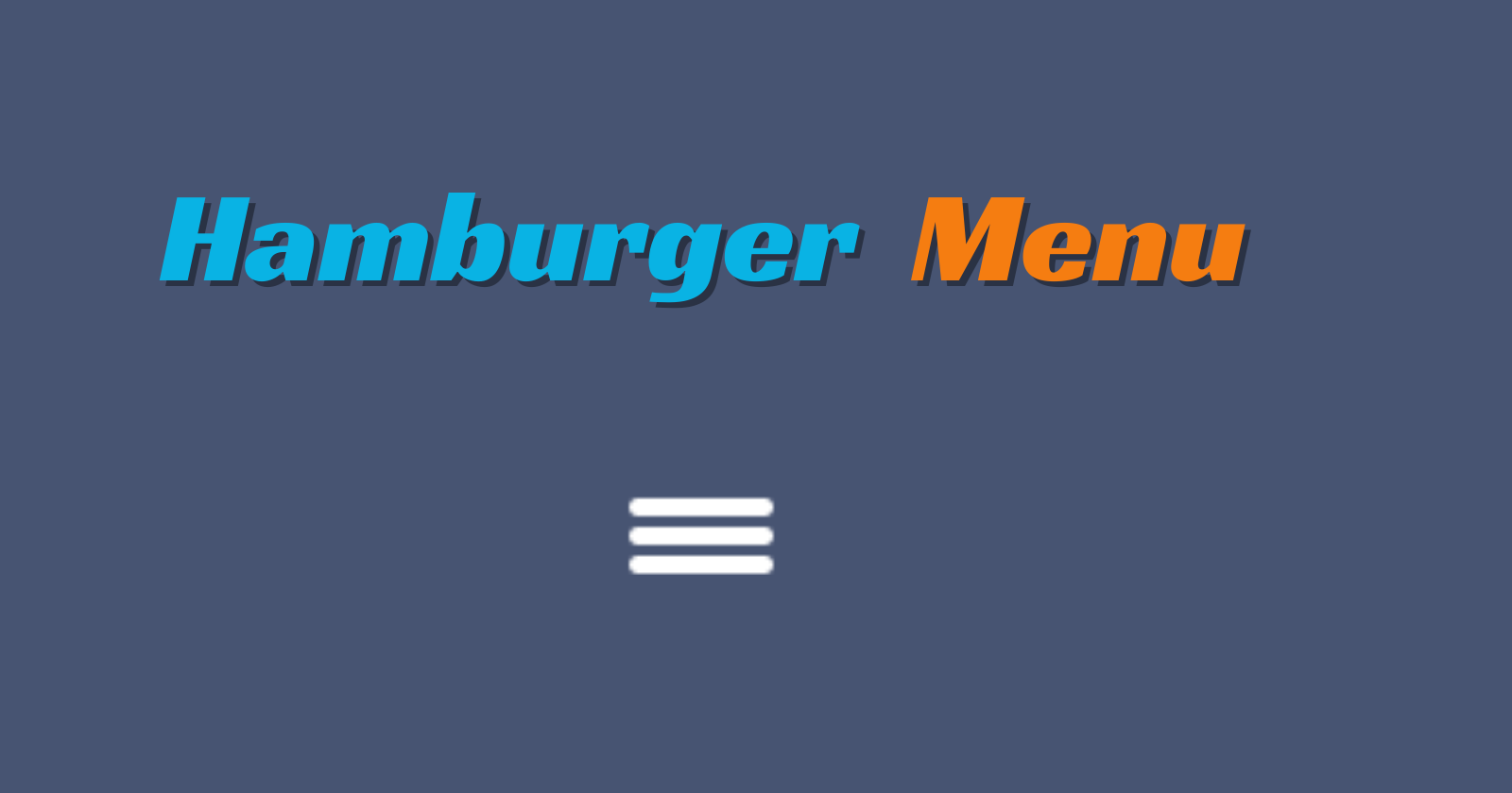
In the world of web development, interactivity is key to engaging users and enhancing navigation experiences. One popular element that adds both functionality and visual appeal to websites is the hamburger menu. In this article, we'll delve into the process of creating a dynamic hamburger menu from scratch using HTML, CSS, and JavaScript.
The Ingredients: HTML Structure
Our journey begins with the foundational structure of our hamburger menu. We start by setting up a basic HTML document and defining the essential components:
<!DOCTYPE html>
<html lang="en">
<head>
    <meta charset="UTF-8">
    <meta name="viewport" content="width=device-width, initial-scale=1.0">
    <link rel="stylesheet" href="styles.css">
    <title>Hamburger Menu</title>
</head>
<body>
    <div class="hamburger_menu">
        <div class="hamburger_bar"></div>
    </div>
    <script src="./script.js"></script>
</body>
</html>
The Flavors: Adding Style with CSS
Next, we infuse our hamburger menu with style and personality using CSS. Here's how we spice things up visually:
*,
::before,
::after{
    padding: 0;
    margin: 0;
    box-sizing: border-box;
}

body{
    width:100%;
    height:100vh;
    background:#475472 ;
    position: relative;
}

.hamburger_menu{
    width:40px;
    height:30px;
    position: absolute;
    top:50%;
    left: 50%;
    transform: translate(-50%, -50%);
    cursor: pointer;
}

.hamburger_bar{
    height:5px;
    width:100%;
    background: #fff;
    border-radius: 100vh;
    position: absolute;
    transition: all .3s ease-in-out;
}

.hamburger_bar::before{
    content: "";
    width:100%;
    height:5px;
    background: #fff;
    border-radius: 100vh;
    position: absolute;
    top:-8px;
    transition: all .3s ease-in-out;
}

.hamburger_bar::after{
    content: "";
    width:100%;
    height:5px;
    background: #fff;
    border-radius: 100vh;
    position: absolute;
    bottom: -8px;
    transition: all .3s ease-in-out;
}

/* Animation for the hamburger menu */
.open .hamburger_bar {
    background: transparent;
}

.open .hamburger_bar::before {
    transform: rotate(-45deg);
    top: 0;
}

.open .hamburger_bar::after {
    transform: rotate(45deg);
    bottom: 0;
}
The Magic Touch: Adding Behavior with JavaScript
Finally, we bring our hamburger menu to life by adding interactivity with JavaScript. With a sprinkle of JavaScript magic, our menu responds to user clicks:
const hamburgerMenu = document.querySelector('.hamburger_menu')

hamburgerMenu.addEventListener('click', (e) => {
    e.currentTarget.classList.toggle('open')
    console.log(e.target.classList)
})
Conclusion
Voila! With a blend of HTML, CSS, and JavaScript, we've whipped up a delightful hamburger menu that's both stylish and functional. Experiment with different flavors, animations, and interactions to create a menu that suits your website's taste. Happy coding!
Check out the live demo and code:
CodePen: Link to CodePen
GitHub Repo: Link to GitHub Repo


